Accessible Buzzfeed
2020-08-27
This article was originally published on the BuzzFeed Tech Blog

Last month, external accessibility experts certified buzzfeed.com as compliant with the best accessibility practices for the web. That simple statement, ripped straight from the headlines of a boilerplate internal email, does not do justice to the two-year process that brought us to that point. Nor does it embody what the achievement means to our team, especially myself, on a personal level.
In 2004, I watched my grandad build a remote control plane from scratch in his garage. I sat cross-legged at his feet on the grubby floor, ten years old. He was an engineer his whole life, a car mechanic, an ex-steel worker. His garage was filled with tools and machinery and he’d mastered all of it.
In 2016, I watched that same man try to shop online, an iPad in his lap. By then, diabetes had taken his foot, much of the sensation in his fingers, and left him with only a narrow, milky porthole for his vision. He manipulated the screen with a stylus attached to a lanyard. Even with that affordance, I watched him open Safari and make multiple attempts to select the address bar. That done, he slowly tapped in “ebay”, then made a few stabs at tapping the top result in the Google results. Presented with the homepage of ebay.com, he tried to pinch-to-zoom to find the search box, inadvertently activating a link to a promotion for a lawnmower.
A lot of people will have a story like this, perhaps less severe, perhaps worse. Statistically speaking, you’re pretty likely to have a similar anecdote, either about yourself or a loved one — after all, 1 in 4 Americans has a disability that may affect how they interact with screens. As the world fills more and more with those screens, it is going to shrink for those people unless the architects of those experiences take them seriously.
Accessibility at BuzzFeed
For me, it’s incredibly difficult to separate these personal moments from my day job as one of the people who builds BuzzFeed. Building things for the web is an invisible avalanche of tiny decisions influenced by a mix of implicit and explicit motives: make it fast, make it fun, make it profitable, make it maintainable, make it measurable. We occasionally spend some time talking about one of those things in isolation: a meeting about maintainable architecture, about adding the right metrics to our software. We then hope that those things stick around in the morass of motives in our colleagues’ minds when they’re building stuff. Sometimes it does stick, and sometimes it fades out in favour of bigger, newer, shinier priorities. We take great care to measure and report on the stuff that’s important to us as a business, but not all of the variables can be measured easily. The true quality of the experience we provide to a user with accessibility needs can’t be meaningfully quantified. Instead, maintaining and monitoring accessible experiences takes sustained effort from everybody who works on the product.
In the winter of 2018, we at BuzzFeed decided to take some serious action about making buzzfeed.com an accessible experience for everybody. We knew anecdotally that we weren’t doing well on the accessibility front. Engineers familiar with accessibility standards raised their concerns regularly, and fixes were made here and there; we had an #a11y Slack channel. This time, though, we would be taking a more thorough and holistic approach to accessibility, not just a series of patch jobs. We would contract with a specialist accessibility auditor, Accessible360, who would produce a full report of all of our issues, and review our fixes as they went in. The end goal: an accessible experience accredited by the experts.
The initial audit report landed in our inboxes in January 2019, and our fears were confirmed: we had completely failed to provide a viable experience for users with accessibility needs. The issue tracker showed in excess of 400 problems with the site, and some of them sounded insurmountably difficult to solve within our current technological and organizational structures. There was no obvious single group to own all of the fixes, nor was there any one team big enough to get through the issues in any reasonable amount of time. It was going to have to be a holistic effort.
The issues could be categorized into two general buckets. The first bucket was smaller fixes — missing button titles, content presented as a list but not marked up as such — and could easily be divided among the teams who maintained those portions of the site. The issues in the second bucket, however, were going to take more dedicated effort and product thinking to resolve.
Here’s one example of an issue that needed to be tackled more strategically:
A Case Study
“These images lack alt attributes, thus it is not clear what they contain.”
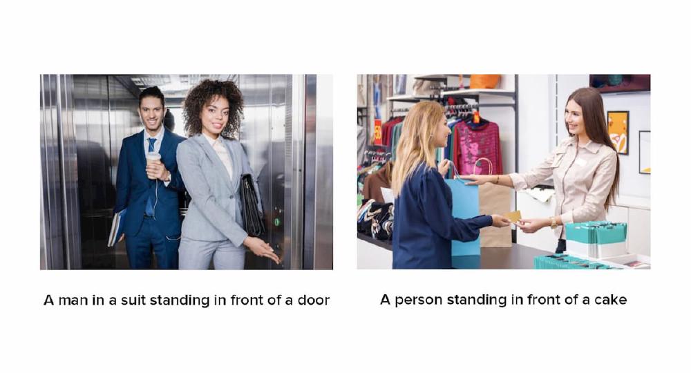
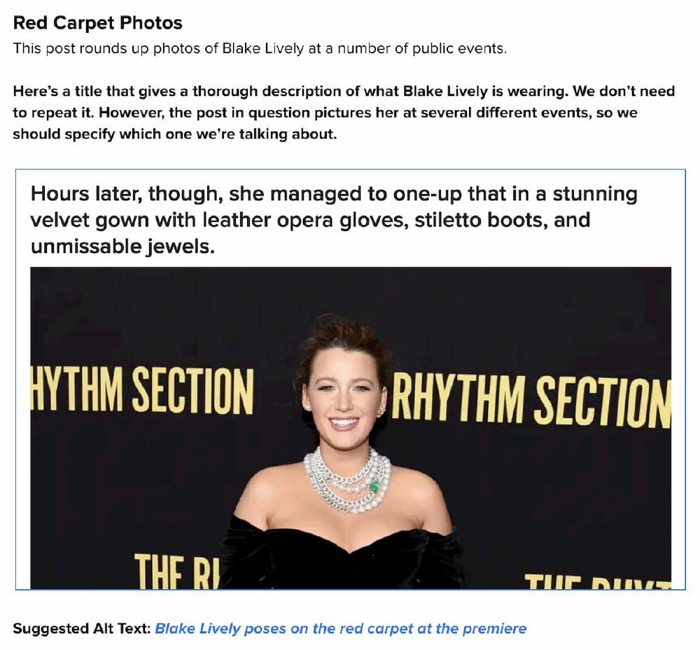
BuzzFeed is full of images. We tease our articles with carefully selected and cropped thumbnails. The articles themselves are often adorned with gloriously art-directed banner images, stacks of red carpet photos, and the latest celebrity apology in a series of screenshots of the Notes app. In all of these cases, our content creators are putting a lot of work to tell stories with a visual medium that is inaccessible to users who can’t see the screen. To be accessible to somebody using a screen reader, those images need an alternative way to be experienced — in this case, descriptive alt text. When our writers have uploaded images to our content management system (CMS), we’ve never required them to provide descriptive alt text — or even provided them with the option to do so.
First, we tried to avoid changing our editorial workflow. We assessed different machine learning services that offered to describe the content of images programmatically. None of them could describe everything, let alone describe it well.

We quickly realised that there was only one solution: to consider alt text as integral a piece of content as any piece of visible text in an article. That meant it would fall to our writers and editors to understand the importance of alt text and to write great image descriptions. So, while our engineering team whittled away at hundreds of issues that could be fixed in the background, we worked with our editorial team to put on workshops that demonstrated how screen readers experience our content. After establishing that understanding, we discussed the best alt text for all our different types of image content: from red carpet photos to meme screenshots to shopping items.

The editorial team didn’t just learn how to write alt text to pass the bare minimum standard. They brought alt text into their style guide, making sure the BuzzFeed voice shone through regardless of how someone experienced the content. The members of the team who attended multiple workshops became experts in good alt text, and now they help their colleagues write it every day. Andrew Ziegler, an editorial colleague who came to many of these workshops, remarked that the burden of writing good alt text was far less than expected: “You’re encouraged to keep it short … you’re not supposed to be redundant and repeat yourself, and you actually have a ton of freedom with it.” Furthermore, these workshops validated that our writers and editors were best placed to provide these descriptions: “Instead of robotically spewing out what’s in the image, you treat it like any other written part of the post and you’re free (and even encouraged) to carry the tone of the post into the alt text itself.”
We have a dedicated Slack channel where they exchange tips and establish practices for new kinds of content that present challenges for describing things at the appropriate level of detail. It’s inspiring to see that this enormous problem could be solved by our team by providing the right information and resources, and that they dove into the subject without hesitation once they understood how much the problem impacted our users.
Doing The Work
When we embarked on the task of making BuzzFeed accessible to all, we set ourselves a tentative and extremely ambitious task. Over a hundred individuals have worked on fixing one of those 400+ issues in some way or another.
The biggest shift over the course of the last year goes above and beyond just a pile of bug fixes — changing our site also changed how we think about building our site. The consequence of having so many contributors to the technical side of our accessibility initiative is that nearly all of the front-end engineers working on the website have now made targeted accessibility fixes, and can identify and prevent additional instances of them in the future. This influence extends past engineering as well: product managers, designers, and QA engineers are now all more attuned to our accessibility concerns. We’re starting to hear “it’d be a huge accessibility win” in the arguments for a new feature or change. I think it’s becoming part of our DNA, and that makes me incredibly hopeful.
We’re trying to harness that new wave of motivation by supplying the best tooling and documentation. So far, we’ve used a mixture of the great assets already out there, such as accessible component recipes, as well as making some home-cooked guides on how patterns common to BuzzFeed have been made accessible in the past. Accessibility has also become a foundational part of the ongoing design language project.
Conclusion
The arrival of our letter of accessibility compliance from our external experts marked the end of an enormous push to fix years of inaccessible feature development. Our website is finally accessible to all. Whoever wants to read an article, take a quiz, leave a comment — they can do it. The work that is ahead of us now is making sure that accessible culture is a mainstay of how we build and write content at BuzzFeed.
I’ve noticed a real push lately to make digital products accessible to everybody. That’s probably partly due to an uptick in lawsuits under the Americans With Disabilities Act (ADA). However, I also think that there has been a recognition that we’ve replaced significant services and products that used to be physical, tactile things — like newspapers, television sets and telephones with dials and buttons — with digital applications. If you want to buy something particularly obscure, an electric motor for a remote control aeroplane, for example, you’re best off doing it online, particularly during a pandemic. People who want to take a quick picture usually aren’t reaching for their big manual cameras, but their little touch-screen phones. If the digital device is to be the mediating layer between us and the world, as it increasingly is, it must work for everybody.
We have finally reached a place where buzzfeed.com provides an accessible experience for all. My grandad passed away, but I can now imagine him asking about my job and being able to skim through articles on our homepage with VoiceOver on his iPad, as easily as he could roll his wheelchair down the ramp into the garden to listen to the aeroplanes overhead.